Showing posts with label clock. Show all posts

Thursday, October 29, 2020

Let's Squash It #1

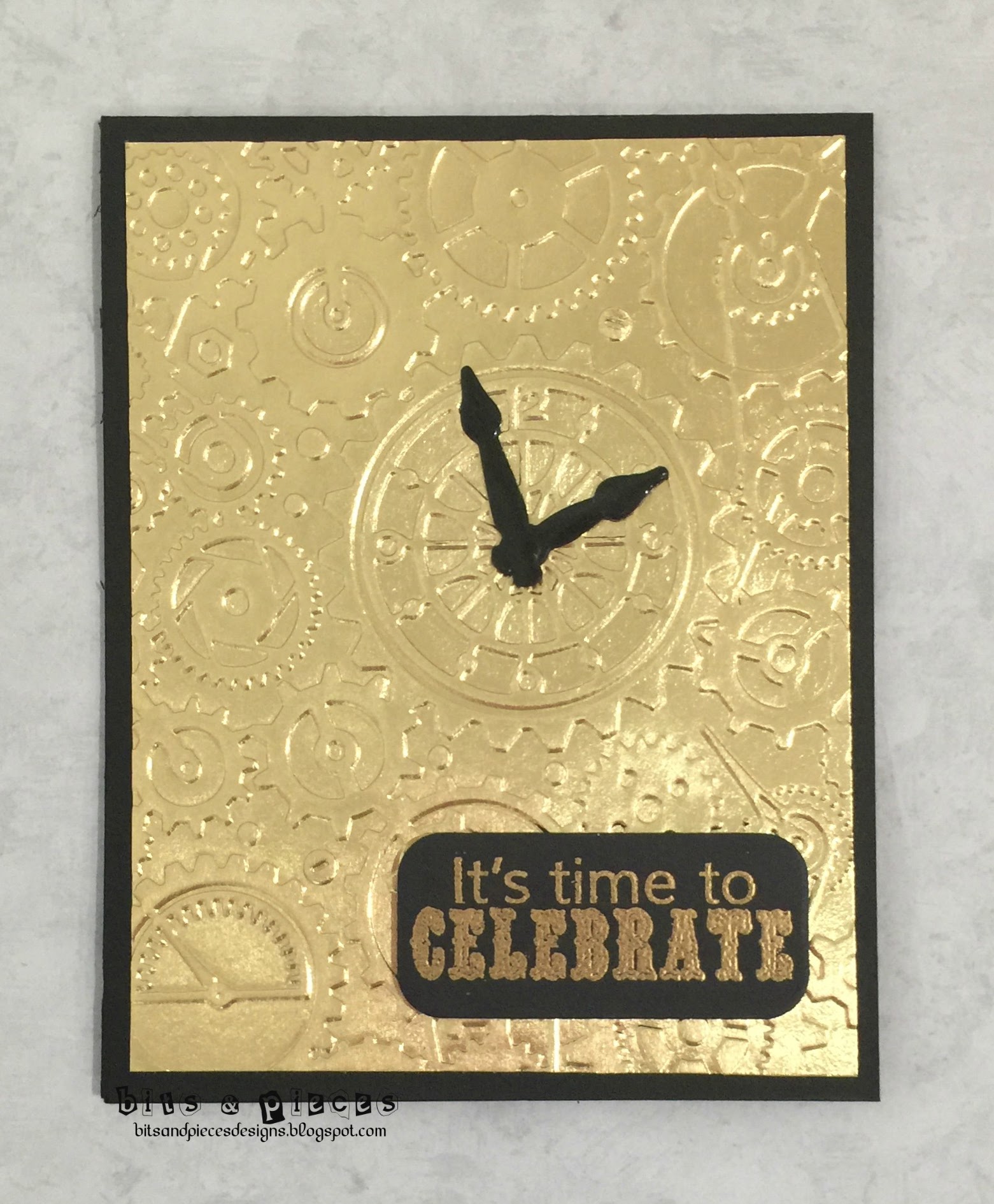
There's a new challenge in blogland and it encourages insists you use embossing folders.  We all have them and forget to use them so this will help remind us to get creative with embossing.  The first challenge at Let's Squash It! is:

Isn't that graphic something else.  lol    

The metallic part is gold foil and the embossing folder is Clockworks from Cuttlebug. I pulled out an ancient stamp and die set from Cleary Besotted for the sentiment and hands on my clock, which are heat embossed with UTEE.  Sorry you can't see their shine.

Thanks for dropping by.  Why don't you check out this new challenge for yourself.


Sunday, March 15, 2015

City Crafters #252

I'm back for my second stab at City Crafters Challenge Blog, where bloggie friend Darnell is the guest designer.  The theme is "Keys to the Time" and I must admit it had me stumped for a while.  I knew I had one clock stamp but wasn't sure how to use it.  I also knew I had a Cricut cartridge with keys and clocks on it, and I always struggle with what sentiment to use. After some trial stamping and cutting, I came up with this:


First I cut the keys with my Cricut from kraft paper and embossed them with Liquid Platinum and UTEE embossing powders.  They look fairly real and metallic IRL.  Next I stamped the clock face from Clearly Besotted all over some PTI Rustic White cardstock, added the NBUS sentiment from Penny Black and the keys.  This will be off to my brother next month.

Thanks for stopping by.

Tuesday, March 3, 2015

TO #25, STB and ATCAS #58

One, two three o'clock,  four o'clock rock.  I could go on but I won't bore you with the lyrics. A lot of you may remember this from "Happy Days" but I member Bill Haley and the Comets way back when. This is the theme at Time Out - Rock Around the Clock.


I only have one clock stamp and I couldn't figure out what to do with it so I went a completely different direction.  I used my clocks embossing folder with some Tim Holtz distress cardstock with a kraft center.  Then I sanded it to reveal more of the embossing, trimmed the panel and mounted on on kraft cardstock.  A sentiment from Hero Arts is embossed on vellum with Liquid Platinum.

Distress paper and sanding means this can enter the challenge at Addicted to CAS - Distress, and I'm also sending it to Seize the Birthday with the Masculine topping.

Thanks for stopping by.


Thursday, January 8, 2015

Less Is More #205

I need a number of masculine birthday cards in the next couple of months and I thought the challenge at Less Is More - use black, metallic and one other color - sounded very masculine.

The stamp set is from Clearly Besotted, done in Liquid Platinum, with cream as my "other" color.

Thanks again for stopping by.  I always appreciate your visits and comments.